
Brands across every industry now depend on digital presence, so the demand for responsive website development services keeps increasing year after year. Most users explore the web through mobile screens first, which means a business cannot afford a layout that breaks or loads poorly on different devices. A responsive website adjusts its structure in real time, and this flexible behaviour helps visitors stay longer and interact more confidently with the brand. Even a small improvement in screen adaptability can offer a noticeable boost in engagement.
Many business owners misunderstand responsiveness as basic resizing, although the process involves careful planning of grids, fluid media, and breakpoints that respond to user behaviour. Skilled teams who specialise in custom website development understand how elements shift across devices without losing clarity or speed. That is one reason search engines favour websites that maintain performance across all screen sizes. When a page loads fast on a mobile device, it gets ranked better and builds trust with users who expect smooth journeys.
This blog guides you through the role of responsiveness, the methods used to build adaptable layouts, and the benefits businesses gain by investing in strong development practices. The aim is to make the concept simple even if you are not fully technical.
Why Responsive Website Development Services Matter
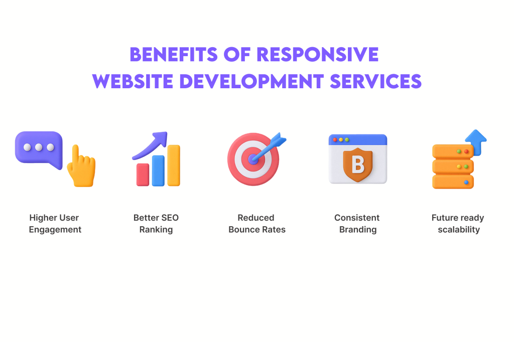
Businesses operate in a fast environment where user attention shifts very quickly, so the value of responsive website development services becomes obvious the moment a visitor lands on a page. When a website adapts smoothly to different screens, users experience fewer layout issues and feel more confident while navigating. This ease of movement creates a positive impact on engagement rates, which naturally increases the chances of conversions. A responsive layout also improves brand perception because people trust businesses that offer a stable viewing experience across all devices.
Responsiveness also plays a strong role in search performance. Search engines reward mobile friendly websites because they deliver better user satisfaction. If a page breaks on smaller screens or loads with delay, rankings drop even when the content quality is good. Development teams use structured techniques like flexible grids, scalable media, and clean code patterns to maintain stability under various device widths. These methods keep the website functional and visually steady.
Many companies choose website redesign when they realise their current site fails to serve mobile users effectively. With the right development approach, they not only fix layout issues but also enhance accessibility, retention, and load speed. The benefit extends beyond design because responsiveness supports long term digital growth.
Key Elements of Responsive Website Development Services
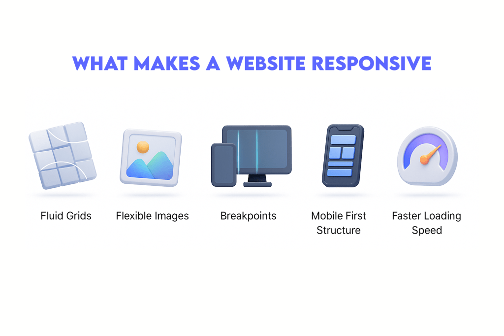
Every successful digital project depends on how well its structure adapts to different environments, and that’s why the main elements behind responsive website development services matter so much. A responsive layout begins with fluid grids that expand or shrink depending on the screen size. These grids help maintain balance, and they prevent sections from collapsing awkwardly when users rotate or switch devices. Developers also work with flexible images and media rules that keep visuals clear without slowing the page.
Breakpoints are another important part of responsiveness because they define how a layout shifts at different widths. Properly planned breakpoints allow content to remain readable while still staying visually appealing. When this foundation is combined with improved load performance, visitors experience quicker interactions during every session. Even small tuning can reduce friction for users who dislike delays.
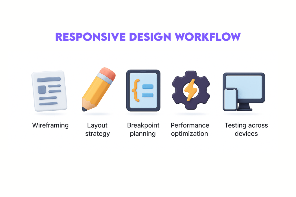
Modern teams rely on structured methods to make these elements align with a brand’s goals. While working on large platforms, many companies also explore the website development process to understand how each stage contributes to responsive behaviour. From wireframes to testing rounds, each phase ensures that the final design supports consistency across devices. This combination of planning and technical accuracy is what gives responsive websites their steady performance.
How Responsive Design Improves User Experience
A smooth and predictable user experience is the biggest reason brands invest in responsive website development services. When a visitor opens a webpage, they expect the layout to adjust instantly without stretching or breaking. A responsive design ensures text stays readable, buttons remain easy to tap, and images scale cleanly across devices. This level of comfort makes users explore more pages and feel less frustrated during their journey. Even a slight improvement in readability can keep a visitor from leaving too soon.
Another major advantage is the stability of user interactions. When navigation menus adapt well and content blocks stack correctly, users feel guided instead of confused. This feeling of control often leads to better session duration and stronger trust in the brand. Businesses that want to build long term relationships with customers focus heavily on this experience layer. Development teams run multiple device tests and refine visual behaviour until the layout feels natural everywhere.
Responsive design also creates a consistent identity for the brand. Whether a user views the website on a phone or a desktop monitor, the look and flow stay familiar. Many companies choose professional custom website design to maintain this uniform identity while still keeping the layout flexible. A strong user experience keeps visitors returning, which is the first step toward meaningful conversions.
Mobile First Approach in Responsive Website Development Services
Many brands now follow a mobile first strategy because most users browse from smartphones, and this practice aligns naturally with responsive website development services. A mobile first layout starts with the smallest screen size and slowly expands to larger devices. This method helps developers focus on essential content, quicker page loading, and a clean structure that feels effortless for users. When the design begins from mobile, the entire layout becomes more efficient and scalable.
Developers also use this approach to avoid clutter that often appears when websites are designed for large screens first. Mobile screens require precise spacing, simple navigation, and optimized elements, so the team carefully shapes each section to deliver clarity. These improvements help reduce bounce rate and build stronger engagement among users who expect speed and comfort.
Search engines also reward mobile first websites because they deliver smoother performance. A well planned structure supports flexible grids, adaptive images, and optimized breakpoints, which all work together to enhance usability. Many companies that aim for long term growth explore website development trends to understand how mobile behaviour shapes modern design styles. A mobile first strategy ensures users receive a consistent experience, no matter what device they choose.
Performance Optimization in Responsive Website Development Services
Performance optimization is a core part of responsive website development services, because even a beautifully designed layout fails if the page loads slowly. Users expect instant interaction when they open a website, so developers reduce heavy scripts, optimize media files, and choose efficient coding patterns that support faster responses. When each asset loads smoothly across devices, visitors feel more comfortable staying on the website.
Caching, compression, and smart rendering techniques also contribute to stronger performance. Developers monitor how different devices handle layout shifts and make adjustments that prevent delays. This consistent tuning avoids frustration for users who dislike waiting for pages to load fully. Smooth performance directly influences engagement, session duration, and even search rankings.
Another important factor is third party scripts. When too many tracking tools or external resources load in the background, the page slows down. Teams carefully evaluate these elements and remove anything that adds weight without offering real value. Many businesses focus on web development frameworks to build efficient, fast loading structures that support growth. They also keep an eye on web development tools that help measure speed and fix bottlenecks quickly. A fast website improves user satisfaction and builds trust, making performance optimization a key part of responsive design.
Role of Breakpoints and Layout Adaptability
Breakpoints are one of the most important structural elements behind responsive website development services, because they decide how the layout adjusts when the screen size changes. A well planned set of breakpoints helps the website shift smoothly from mobile to tablet and then to desktop layouts. Each breakpoint controls spacing, alignment, font size, and image scaling so the design never feels broken or stretched. Users experience a stable flow even when they rotate their screens or switch devices.
Developers spend careful time studying user behaviour before setting breakpoints. They test how content behaves at different widths and refine the structure until everything feels predictable. Layout adaptability also ensures the website delivers uniform branding and readability across all devices, which improves the user’s comfort during navigation.
Flexible containers, percentage based widths, and scalable media components help designers maintain this adaptability. These techniques create a layout that responds intelligently to real world usage rather than fixed dimensions. Many projects also take support from best tools for responsive web design to check screen behaviour and refine visual flow. Businesses exploring custom web application development benefit from adaptive layouts because the interface feels natural for both simple pages and complex data screens. Breakpoints give responsive websites the stability needed for long term performance.
SEO Benefits of Responsive Website Development Services
Search engines reward websites that deliver consistent performance across devices, which is why companies rely on responsive website development services to strengthen their SEO foundation. A responsive layout reduces duplicate content issues because all device views rely on the same URL and HTML structure. This approach makes it easier for search engines to crawl and index pages without confusion. When mobile users experience a stable design, bounce rate drops, and search algorithms recognise the improved engagement.
Page speed becomes another ranking factor tied closely to responsiveness. A website that loads quickly on mobile screens often performs better on search result pages. Google checks mobile friendliness as a core ranking signal, so brands that invest in responsive practices usually see improved visibility. Clean code structure, optimized images, and flexible styles also contribute to better crawlability.
Responsive websites encourage deeper user interaction because visitors find the layout comfortable and easily readable. These behaviours send positive signals that enhance long term SEO performance. Many businesses look for reliable ecommerce website development services to maintain both responsiveness and product visibility. Some also prefer partnering with an experienced website development company to ensure that technical SEO aligns with responsive behaviour. The combination improves ranking strength and positions the brand competitively in the market.
AI Powered Enhancements in Responsive Website Development Services
AI is reshaping the way developers handle responsive website development services, because it helps automate key decisions that improve adaptability and performance. Machine learning tools can analyse user behaviour, screen interactions, and heatmaps to predict how different layouts should respond. These insights help developers refine spacing, adjust breakpoints, and simplify navigation for smaller devices. AI also detects design issues early, which saves time and reduces manual testing pressure during development cycles.
Another advantage is automated content scaling. AI powered tools can rearrange elements based on user preferences, ensuring every visitor sees the most relevant information in the best format. This personalised layout flow increases engagement and makes the website feel more intuitive. Predictive algorithms also assist in optimizing image sizes, preloading patterns, and media delivery, which enhances overall loading speed.
AI systems also support accessibility improvements by suggesting readable fonts, contrast adjustments, and interaction patterns suitable for all users. Many companies integrate ai-powered website development practices to build smarter, more adaptable digital platforms. Others rely on leading ecommerce website development company in India partners to implement AI features that boost user journeys. These enhancements create websites that respond not only to screens but also to user expectations.
Choosing the Right Responsive Website Development Partner
Selecting the right team for responsive website development services can influence how well your digital presence grows in the long run. A good development partner understands both design behaviour and technical performance, which helps create websites that adapt naturally across all devices. Before onboarding any team, businesses should evaluate their past work, testing methods, and responsiveness strategy. A company with strong problem solving skills will always focus on layout stability, load speed, and consistent branding.
Communication also plays a key role. A skilled team explains their workflow clearly and shares insights that help clients understand each development stage. This transparency builds trust and avoids unexpected issues during deployment. Many brands also check whether the development partner can integrate advanced tools, scalable frameworks, and performance monitoring systems that strengthen adaptability.
Portfolio variety is another factor to consider. Developers who have handled diverse projects often create more flexible and reliable websites. Businesses looking for local expertise sometimes work with website designers in chennai for more personalised support. Others choose teams with specialised experience like a Transportation website development company when they need industry specific solutions. The right partner ensures your responsive website stays stable, future ready, and aligned with user expectations.
Industry Use Cases for Responsive Website Development Services
Different industries rely on responsive website development services for unique reasons, and each sector benefits from adaptable layouts in its own way. Retail brands depend heavily on responsive product pages because users often browse on mobile devices while traveling or during short breaks. A flexible design ensures customers can view products, compare prices, and complete purchases without frustration. Even small improvements in layout clarity help increase conversion rates.
Service based industries, such as healthcare, consulting, and education, use responsive websites to deliver structured information to patients, clients, and students. When navigation works smoothly across devices, visitors find the resources they need quickly. Industries that showcase portfolios, such as construction or interior design, rely on responsive galleries so visuals stay clear on both small and large screens.
Enterprise platforms and SaaS companies also depend on responsive behaviour, especially when dashboards and forms need to work across laptops, tablets, and phones. Strong adaptability improves user onboarding and reduces technical support requests. Many companies collaborate with website developers in chennai to implement sector specific layouts that feel natural for their users. Larger brands often partner with a top website development company to create scalable systems that support long term demands. These use cases show how responsiveness supports both engagement and operational clarity.
Future Trends in Responsive Website Development Services
The future of responsive website development services is moving toward smarter, adaptive systems that understand user needs more naturally. Developers are exploring new interaction patterns, flexible container systems, and device aware components that reshape how websites behave. These advancements help create interfaces that adjust not only to screen sizes but also to user context, motion, and browsing habits. The goal is to deliver experiences that feel seamless across different environments.
Another major trend is the adoption of container queries, which provide more control over layout adjustments inside components. Instead of relying only on screen width, developers can now adjust designs based on container size. This shift offers better precision and improves the stability of complex layouts. Enhanced variable fonts also play a strong role by allowing smoother text scaling without losing clarity.
Performance will remain a priority as technology evolves. Websites will adopt faster rendering layers, lighter assets, and improved caching strategies to maintain speed even with richer interactions. Many brands are also focusing on advanced strategies used by a top 10 web development company in chennai to stay competitive in the evolving digital landscape. Others follow insights from a top 10 website development company in delhi to understand regional user expectations. These trends indicate a future shaped by flexibility, intelligence, and refined performance.
Cost Factors in Responsive Website Development Services
Understanding the cost behind responsive website development services helps businesses plan their digital growth without confusion. Pricing varies because each website has its own structure, features, and performance requirements. Simple websites with basic layouts cost less, while advanced platforms with dynamic content, animations, or integration features require more development time. The complexity of responsiveness also affects cost, especially when multiple device breakpoints and custom interactions are needed.
Another major factor is design quality. A website that needs tailor made layouts, unique component styling, and interactive elements will always involve deeper planning. Developers also consider testing hours because responsive websites must be checked across many devices and browsers. This testing ensures stability and smooth navigation for all users. Hosting selection, security layers, and maintenance plans also influence the final investment.
Businesses often compare agencies before choosing the right team. Some prefer the local support of a website development company in chennai, especially for quick communication and ongoing updates. Others explore insights from a top 10 website development company in banglore to understand cost patterns in competitive markets. While pricing varies, the long term value of a well built responsive website always outweighs the initial expense because it improves engagement, conversions, and brand trust.
Best Practices for Responsive Website Development Services
Applying the right methods is essential for maintaining the quality of responsive website development services, especially when brands want their websites to work smoothly across every device. One of the core best practices is planning the layout with a flexible grid system that adapts to different widths without breaking. Developers also use scalable units for spacing and typography so the design stays readable as screens shrink or expand. These steps help maintain a consistent visual experience that feels natural to users.
Performance tuning is another major best practice. Images should be optimized, scripts must stay lightweight, and caching strategies should be used to boost website loading speed. Even a small delay can push users away, so developers test loading behaviour on multiple networks to ensure stability. Clear navigation patterns, touch friendly buttons, and clean content hierarchy also contribute to a smoother user journey.
Thorough testing is the final ingredient in best practices. Every responsive website should be checked across browsers, operating systems, and device categories to confirm that layouts remain stable. Many brands trust a Best Website Development Company in Chennai to apply these advanced practices consistently. These methods form the foundation of responsive design and ensure long term digital performance.
Scalability and Long Term Value of Responsive Website Development Services
The long term value of responsive website development services becomes clear when a business starts expanding its digital goals. A scalable design allows new pages, features, and content blocks to fit naturally into the existing structure without breaking layouts on different devices. When the foundation is flexible, companies can upgrade their platforms without rebuilding the entire design. This adaptability saves time and reduces development costs in the future.
Scalability also supports performance stability. As user traffic increases, a well built responsive website can handle higher loads while keeping navigation smooth. Developers plan ahead by using modular components, reusable layouts, and clean code architecture. These practices ensure the website stays reliable even when new functionalities are added. Brands aiming for longevity often view responsiveness as a strategic investment rather than a basic design requirement.
Another advantage is the ability to maintain a consistent brand identity across all screens. Users become familiar with the layout and trust the platform more. Many companies follow standards from a Best Website Development Company in India to build scalable systems that grow with their audience. Others adopt structured methods recommended by Top 10 website development companies in India to maintain stability as the business evolves. Scalability ensures the website stays future ready and aligned with user expectations.
Common Mistakes That Affect Responsive Websites
Many brands invest in responsive website development services, yet a few common mistakes prevent them from achieving the full potential of a flexible design. One of the most frequent issues is creating layouts that look good on desktop but break on smaller screens. This happens when developers rely too much on fixed dimensions instead of flexible units. As a result, content becomes cramped, buttons overlap, and users struggle to navigate comfortably.
Another mistake is ignoring performance weight. Even if the design adapts correctly, heavy images, large scripts, or poorly structured styles slow the page. Users expect instant loading, and any delay increases bounce rate quickly. Developers should always compress assets, refine loading behaviour, and keep the code base clean to avoid these performance issues.
Some teams also skip thorough testing. A website may look fine on one device but behave differently on older models or alternative browsers. Testing across multiple screen sizes is essential for long term stability. A responsive layout needs to remain consistent no matter where the user views it. Avoiding these mistakes ensures the website delivers a smooth experience and supports stronger engagement across all devices.

Conclusion
Businesses that want to refine their digital presence often rely on guides, tools, and expert insights that explain how responsive website development services create long lasting impact. Many learners explore industry examples to understand how layout adaptability improves engagement across different sectors. For deeper clarity on design principles, resources like the Moz Web Performance Guide offer practical insights on improving speed and responsiveness. Another helpful reference is the Google Mobile Friendly Test, which evaluates how well a website performs on various devices.
Responsive design is not just a trend. It is a requirement for brands that expect organic growth and high user satisfaction. A well crafted responsive website improves loading behavior, increases browsing comfort, and strengthens overall trust. It also supports long term scalability, allowing new features and content to blend smoothly into the existing structure. When businesses invest in flexible layouts, they build a strong foundation for future digital success.
Choosing a reliable development partner ensures the website performs consistently as user expectations evolve. With the right planning and execution, responsive design becomes a powerful tool for growth, visibility, and customer experience.